Hot Swapping Our Rails Front End In Secret
Hello
Hello. Thank you for coming. Today I'm going to share the story of how the team at Betterment secretly swapped out the entire front end for several of our apps last year in order to launch our new brand identity.

My name is Chris LoPresto. I lead front end architecture at Betterment, and I love helping engineering and design teams find ways to work better together. I play some non-computer keyboards, and you can find me @chrislopresto on GitHub or Twitter.

Rebranding Betterment
Last year Betterment spent 6 months creating a new brand identity. This meant reimagining the company's mission statement, photography style, logo, color palette, the entire user interface of our web and mobile apps, online calculators, emails. Everything had to change.

From start to launch, the entire project took six months. It was the last two month stretch when we built everything.
Now this was an aggressive timeline. We did it to ourselves. Our agency said to expect at least 12 months for the brand exercise. So we said, "How ‘bout half? How ‘bout half that?" We could aim for Betterment's birthday. It’ll be at end of May. That’ll be great. It’ll be after tax season, so no one will freak out if their tax forms suddenly look different. It’ll be before the summer, because no one reads press releases from the beach. Worst that happens, we delay it a little bit.
So in March, this is what our homepage looked like.

But by May we wanted to snaz it up. New colors, photography. New content throughout all of betterment.com.
We wanted to apply the brand to our Retail app. This is what our summary page looked like in March.
By May we wanted new navigation, that new wordmark in the top. Everything’s tighter because it’s on a grid system.

Now investing involves risk. Past performance does not guarantee future results. Although it does look like this user’s about to have a really good two months. So we got that goin' for us

This is what our Portfolio page looked like. Basically the project requirements were, "You see that over there? Yeah? Can't look that way anymore.” So if this seems wildly impractical, buckle up.

Our mission is to redesign everything in 8 weeks, in secret. We want this timed big reveal. All of our apps change at once. Articles appear online. Then we'll bask in beauty of our brand new brand.

Then we thought, well if we already have to touch everything anyway, while we’re in the neighborhood, what if we made everything responsive? You know, never waste a crisis.
So what are we talking about here?

Uh oh. These designs were never going to work at these small sizes. It was going to take a lot of work to get from that to this. Reconstruct all our CSS, all our HTML by May.
You're probably thinking, “It’s gonna be fine.” We’ll just whip out our trusty feature flag framework, design system... and get to work.

At this point it is helpful if you already have one of each. Which we do. If you don’t, no worries. Hopefully this story piques your interest.
Benefits of dark deploying behind feature flags
Big projects are risky, in part because they change a lot of code. One of best ways to cope with risk is by slicing your work up into tiny pieces and shipping them one at a time. Now this means shipping incomplete work. That’s ok. You wait until it’s ready. You hide it behind a feature flag. And once it is ready, flip a switch, turn it on.

Now a huge advantage of this approach is that you can solve problems one at a time when they pop up. You can see what’s working, what’s not. Change your mind about things. And you’re not jerking your users around as you figure all this out.
But a rebrand is so big, it touches everything. How do you put everything behind a feature flag?
At first we didn't know how, but our engineering principles dictated that we had to find a way. The Only way to have a worry-free launch day was to not ship any code on that day. Instead we’d have to get to point we're happy with, flip the switch, andturn it on.
Betterment's feature flag framework is called TestTrack.

It follows visitors and users across devices. We have clients for Rails, JavaScript, and all our mobile apps. We use it all the time to run experiments and dark deploy features.
If you don't yet use feature toggles in your workflow, you Should definitely consider it. It’ll change your life. There are a few gems and some excellent services out there that make it really easy to get going.
But slicing up work doesn't do much good if each slice ruins the last one. Which is often the case when CSS is involved.
Benefits of a design system
For this project especially, we needed to assemble new interfaces on the fly across multiple apps. See what worked. See what didn't. The best way – really the only way to do this efficiently and creatively – is a component-oriented design system which would give us reusable building blocks.

Betterment's design system is called Style Closet. It lets us share patterns and components, evoke Betterment's look and feel across all of our apps. If you don't have a design system, don’t worry. We had to rewrite ours entirely as part of this project.

The important thing to remember is that TestTrack and Style Closet were already integrated in all our apps. Otherwise, no way that this 8 week project timeline would have been remotely possible.
Investing in our systems over the years had put us in a good position such that what once would have been deemed wildly impractical Actually became the basis of our project plan.
But we didn’t know what that meant at the beginning of the project. We were just wondering, “How in the world are we going to do this?”

Forget Gantt charts and press releases. We just need a halfway believable way to get this out the door. How can we get from here to there at all?
To which the engineers say, “I don't know.” But also, “Spike.” Just do something. It doesn’t matter if your prototype is dumb as long as it's concretely dumb. Which is why I like to ask myself, “What's the dumbest thing that could possibly work?” Well, here we go.

We already ship a design system into each app. So I thought, what if we create a rebranded version of the design system? Each app already has a SCSS manifest. What if we made a second one that used the rebranded system behind a feature flag? And then finally, we know that the new responsive designs need different markup. What if we add some view logic that understands the feature flag and knows how to keep our two worlds separate – the stuff that’s in production, and all the new rebranded stuff.
It seemed reasonable enough. So we got to work.

I spent about one minute writing the beautiful "rebrand" CSS that you see here. I wanted something garish, so I figured white on blue oughta do. And I wrote some JavaScript to toggle these styles on in our design system docs site. With the old styles, the typography demo looked like this.
With the new vastly improved styles, it looked like this.

Totally nailed it, right? At this point I started going up to designers one by one and telling them I had started the rebrand project. So they'd get really excited and ask to see it, and then I would show them this. The looks on their faces... varied. But we had what we needed. We had a way to do new style stuff without messing up our old style stuff.
And we shipped this to production. We actually cut a minor version release of Style Closet. And the next step was to try to get this dumb stuff into an app behind a feature flag.
So I upgraded our retail app to the latest version of Style Closet, and made a new rebrand SCSS manifest that pulled in the rebranded system. This is what we wanted to put behind our feature flag.

In our application layout I added logic to use the new stylesheet if this TestTrack feature flag – rebrand_enabled – was on. Now in public, no one's gonna see this nonsense. This feature flag is initially off for all users. But engineers working on the project or anyone else keeping tabs can use our TestTrack Chrome extension to flip rebrand_enabled to true and get the new styles.

And we shipped this to production on day 1 of the project. On launch day, all we had to do was log in to our TestTrack admin site and flip this rebrand_enabled flag for everybody to go live with the new brand.
Now our designers, being a serious bunch, made me make my colors mildly less ridiculous, but things are holding together so far. So for our last trailblazing trick, we're going to juggle old and new markup at the same time.
I ported the CSS for a few of our cleaner, more modern components – the header, progress bar, and footer that you see here – and set about making the demo page work for both the old and the new worlds. That's when things started to get a little weird. Right away.

We had CSS selectors that referenced colors. The colors had changed. So we already needed view logic for a pretty silly reason, and there were much bigger markup changes coming, starting with this SVG logo and the grid system. But getting hacky and hand-wavy, things are holding together pretty well so far. So we decided to push ahead and see if this would work in a real world situation. And an hour later we had an answer. It did not.
Even on the simple pages. Like most Rails apps we used layouts to share page structure and partials to share chunks of markup. Even to hack this far, we need a lot of logic in a lot of places. And so far this was just a reskin. The actual redesigns were going to rearrange all of this content.
So I found myself staring at this ginormous SVG, no longer so sure we'd be able to share one set of markup.
Let's recap. We wanted to ship a rebranded design system, and we did it. Lots of work to do, but we're off to the races. We wanted to use this new design system in our apps behind a feature flag, and we did it. But as for the view logic necessary to set up new brand, nope. Way too complicated. Not going to work.

But the good news is, we're transitioning out of that terrifying feeling at the start of project when all we know is that there's a bunch of things that we don't know, followed by a bunch more things we don't know we don't know.

This pile of unknowns is best faced head on. If we strike out early, blaze a trail, we'll make sure one way or another we can get from wherever we are to whereever we need to be.

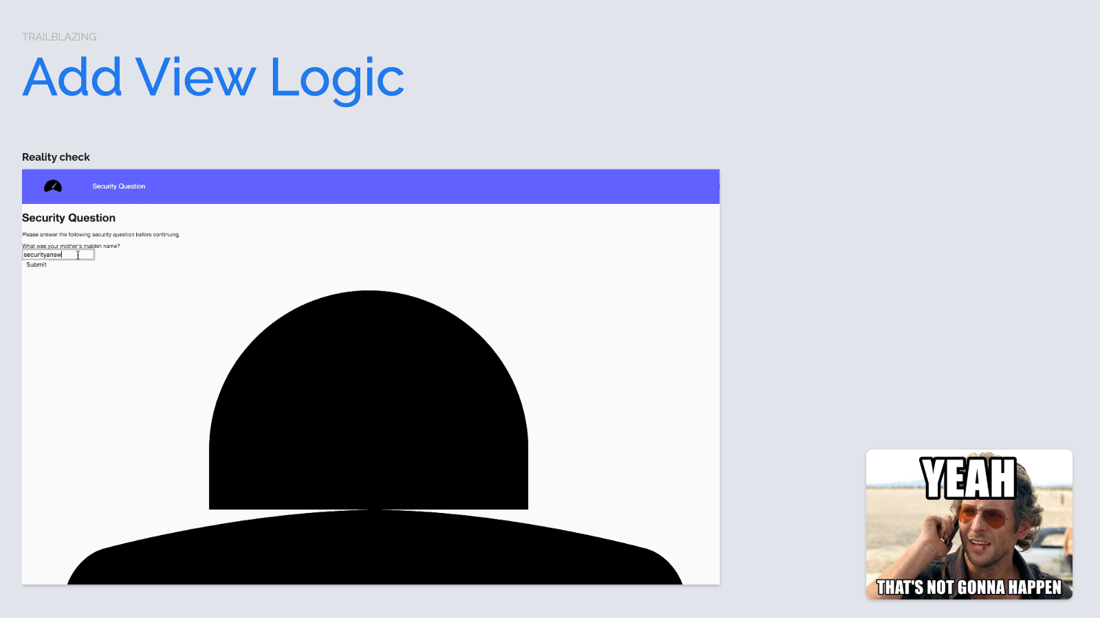
We have our styles worked out, but the tangled view logic showed us that what we really need is a separate view layer for this feature flag. All of our problems will go away if we can just add rebranded versions of views without touching the existing ones... and have a bit of logic that determines which one to show.
Now this is a specific requirement for which Rails has a pretty great answer built right in. Action Pack variants.

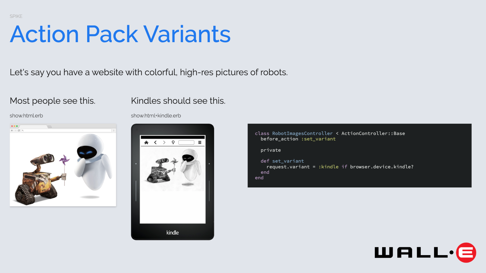
Whether you realize it or not, we're all familiar with the Rails template resolver. When a controller's rendering a request, it's the resolver that knows where to find the view on the file system, e.g. <controller_path>/show.html.erb. What I didn't know is that after that html format, the resolver checks for an optional variant that you can define.
Let's say that you have a website that serves colorful, high-res pictures of robots. You're looking at your logs one day and suddenly realize that you have a lot of traffic from experimental Kindle browsers that can't see color. You decide to optimize images for their black and white existence. The controller can do a browser check and say, "Hey! There's a Kindle making this request. I'm going to set request.variant = :kindle, and that will make the resolver first look for a kindle template. If it doesn't find it, it will fall back to the plain html.erb it's been serving the rest of us all along.
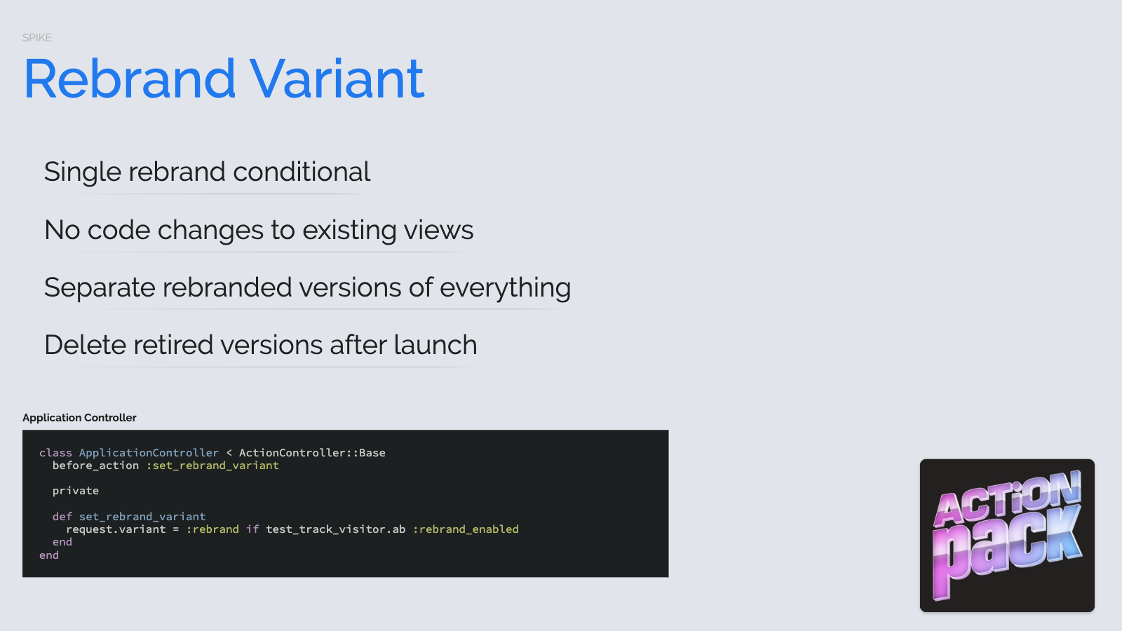
This is built right into Rails. So luckily, when I said out loud, "what we really need is a separate view layer for this feature flag, a coworker of mine matter-of-factly replied, "well, we could use a variant."
All we had to do was move this rebrand_enabled check from our application layout into our application controller. A few lines of code and we were in business.
We realized we wouldn't have to make changes to the existing views for the entire project. And even better, we could just delete them after we launched their replacements. We were excited. It was additive and therefore completely safe to make new rebranded versions of everything. We couldn't break anything even if we tried. Challenge accepted.

Obviously we could. Obviously we did. But our bugs ended being real bugs pertaining to real features, not project config gotchas. So our focus shifted to all the stuff that needed changing.

We audited design system, all of our apps, and came up with a long list of pages and components that either needed to be reworked or rebuilt entirely. As we thought about how long it would take, something had to give.

Style Closet began life as a way to start to share patterns across our apps. But it was tough going, because the apps weren't built with system in mind. Our components never "just worked" when you dropped them in. It was always a fight. Our apps all had complicated CSS codebases that few braved and even fewer loved. I included Captain Sully Sullenberger on this slide to assure us it's gonna all be ok.

The fact of the matter is – as this peer reviewed, totally factual study indicates – CSS is hard. It gets harder as the team grows. It gets harder as the codebase grows.

Our old system suffered all the usual pitfalls. CSS is globally scoped. You introduce a new thing. Something else breaks. So we'd compensate by scoping our rules more strictly in a show of strength. That doesn't stop anyone else from making their change more !important than yours. Perhaps most insidious is that, in reality, you have to use these so-called reusable components at your own risk.
Swapping out entire view layer represented an opportunity to start fresh with a new CSS architecture. And so we decided to rewrite our design system.
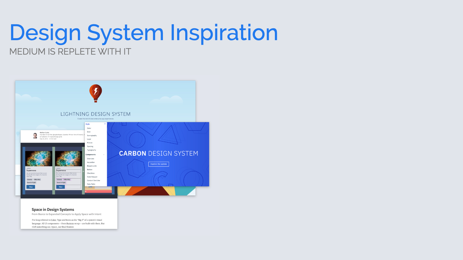
This isn't out of the blue. We had been working towards this. We had internal prototypes, drew inspiration from all manner of open source projects and untold numbers of Medium articles. We were confident enough to make the leap because we felt we'd be able to move faster with the new system than continue to fight the old one.
So we put together a wish list.

- Sensible defaults. We wanted zero config for an app to get going with the system.
- Default element styles, so that semantic markup automatically looked good
- Cohesive systems for spacing, typography, grid, breakpoints, colors
- Ability to apply these system styles consistently in either scss or with utility classes in our markup
- SUIT CSS naming convention – like BEM – so that our components could defend against inward and outward bleed to achieve true reuse

Let's dive in. We built a lot. We're going to move through overly quickly.

We created an exponential spacing scale with increments that were all multiples of 4, used it to create spatial relationships within our components, throughout layouts, every space you perceive. So you could apply padding using this sc-spacing function, which was using a unit tested scss function. If you were assembling page markup in an app, we provided corresponding utility classes built with those same scss functions. To apply same padding, you could use a utility class selector without needing to write CSS in the app.

We had a new color palette, so we made a conventional naming scheme to support functional access in SCSS. We created color and background color utility classes.

We had 5 primary colors, 4 secondary variants of each.

For Betterment's complex data visualizations, we created a gradient system with 100 color stops for each primary color.

Our previous responsive efforts used an ad hoc set of max-width media queries. We took the opportunity to research and standardize on a much simpler set of min-width media queries. Constraining this breakpoint set allowed us to create responsive versions of each utility class. So it's easy to specify a default padding, then loosen it for larger viewports, and still not have to write additional CSS in the app.

We created a linear scale of typography sizes based on the spacing scale. We have font size / line height combinations optimized for our new font. And then we'd adjust line heights and some header font sizes responsively.

In keeping with our goal for semantic markup looking good by default, we created a vertical rhythm system, applied as bottom margins to typographic elements.

Again based on spacing scale, adjusted responsively.
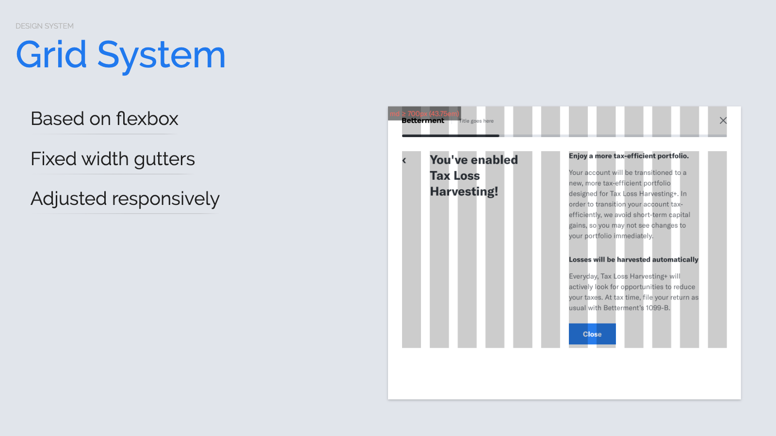
We built a 12 column grid based on flexbox.

We had fixed width gutters, based on spacing scale, adjusted responsively.

Inspired by the Dropbox Paper team, we designed a new icon set in Sketch on conventional artboards. We wrote a script that uses sketchtool to export SVG files, optimize them, generate view partials and a corresponding Rails helper.
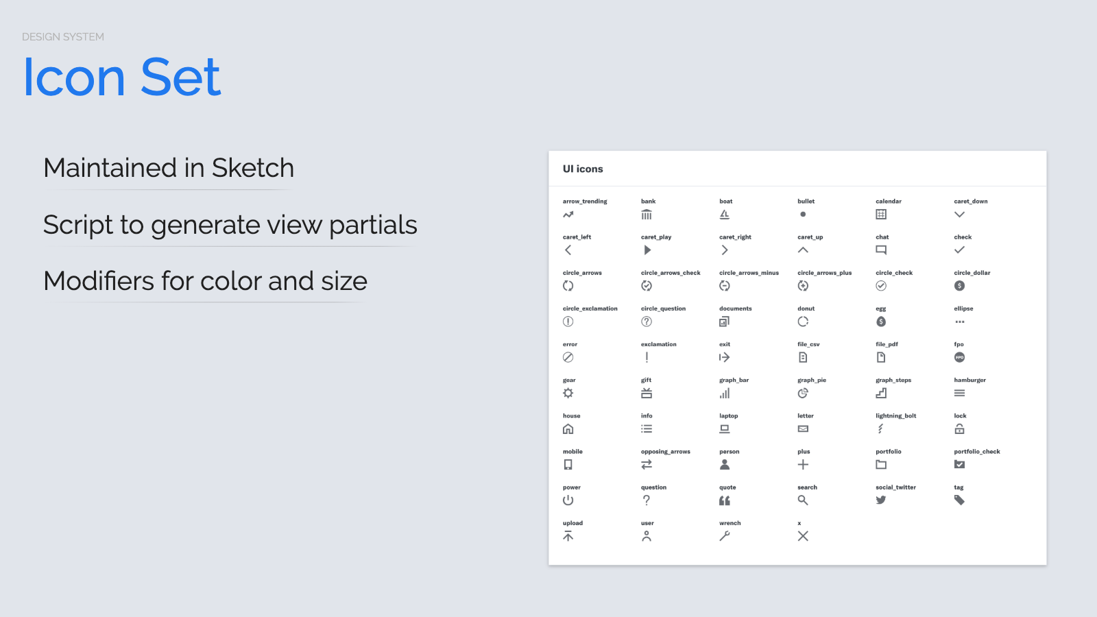
So designers can now change or add icons by updating Sketch and opening pull request.

Engineers can pop them on page using this sc_icon helper. We recently made this interactive icon builder on our design system docs site so that engineers can generate the erb for the icon they're looking for.

We built all the traditional components. Design system classics like Card and Button. For the first time, though, these components were truly reusable.

We could put them in anywhere and they would work thanks to our SUIT CSS naming conventions. We could drop them in, and they'd all play nicely with each other.

We also built layout components with built-in content slots. These components served a dual purpose.

It made it easy for a team to start building responsive pages, because we did all the heavy lifting – taking stacked content slots and then putting them on the grid at larger viewport sizes. They also served as examples for our teams for how to build these components with our new patterns.

We built visualization tools so that you could see the underlying content slots and grid. These are all browser screenshots of betterment.com, visualized with our Style Closet Chrome extension. As we built each new piece, we used the visualization tools to check our work.

Suffice it to say, an action-packed, productive few weeks with unprecedented levels of collaboration between our engineering and design teams. For the first time we had designs expressed by a system, built with the system. And then, as teams began to use the system, we immediately noticed a step change in the pace of our UI development.

Pages that used to take a day would spring to life in about an hour. Engineers ended their demos saying, "I didn't write any CSS. And it's responsive!"

Now I don't want to paint too rosy of a picture. There was a learning curve. It was a lot of work. But at this point we knew we had made all the right strategic choices. So the only remaining question was, "Can we hit our deadline?"

When can we launch the new brand to the world and return to our regularly scheduled programming?

Now a fixed date and a fixed scope are not a winning combination. We were stressed because we didn't seem have a way to punt on anything. A brand isn't something you can turn partway on. We needed all of our pages to be in on the action. We had two levers we could pull – the date and the scope. We didn't want to shift the date, but we didn't know how to shift the scope. So we were stuck.
Maybe just to lift our spirits, we looked at everything we had already done. We had used view variants to great effect. We now had this secret rebrand mode that internal employees were testing behind a feature flag.
And then, while reliving the insight that led to this, we had this moment of clarity. Or deja vu. Or, I don't know, it may have been amnesia. We just did the exact same thing again and made a lighter-weight reskin mode.

With just a few tweaks to our variant logic, we wired up a switch that teams could flip to reskin a page. With a single line of code, you'd get a new variant – which meant new colors, new font, and some breathing room. It wasn't going to be the end of the world if a page or a section wasn't quite done by the launch deadline. We could get on brand enough in the meantime without having to completely solve every last technical problem.
And it yielded surprisingly good results. We even chose to leave some of the deprecated systems reskinned permanently until their ultimate demise and deletion from codebase. Most importantly, we had decoupled done from launched.

Constraint really is a wonderful thing. We were debriefing after launch, kind of pondering how we would have arrived at these results with our normal iterative processes. And we're not sure that we would have. Definitely not as creatively and efficiently. We shipped more code – full of better ideas – more quickly than we thought possible. And we eliminated far more debt than we created.
Not only did we hit our birthday launch date, but we were so relaxed on that day, some of us may or may not have been sound asleep when we flipped that feature flag on. Constraints improved our plan and improved our results. Quantifiably!
There are many reasons to be careful when intensifying effort around project deadlines. By definition you're subverting the notion of sustainable development pace. And it's a fantastic way to turn working software into buggy software. So we analyzed pull request stats during and after project.

Because we're doubling down on the design system, the Style Closet repository saw the most dramatic spike – 247 pull requests. Now for perspective, this represented 49% of Style Closet pull requests ever. But that first half had been spread over 2.5 years, not 54 days.
We shipped 44 releases of Style Closet, which means we were releasing every workday. Then we launched and were immediately back to normal. So at the very least, even accounting for recoil and recuperation, this reflects a lack of panicky, show-stopping bugs.
With betterment.com, you kinda see a calm before storm. We knew all of the content was on its way out the door. Then you see this huge spike, because we built an entire new Wordpress theme with our new design system. We turned it on on launch day, and again, Immediately back to normal.
Now our retail app is part of repository that contains other apps, so there's not as clear of a signal here. There's a delayed spike – partially because we were waiting on the design system, partially because there was a bit of a rush to hit that deadline. Then we're immediately below normal. So we told ourselves it's probably easier to work in new world, although it was now summer.
But we were thrilled. This is what what we'd hoped to see.
Now let's take a look at all the CSS that we wrote. CSS rules are assigned a numeric specificity. Highest score wins. In case of a tie, last one wins. Harry Roberts of CSS Wizardry came up with this experimental notion of a specificity graph. On the x axis, you plot rules based on their order in the cascade. On the y axis you plot their specificity. He mused, loosely speaking this line should be smooth and trend upward. If you write a dodgy rule, some poor unfortunate rule that comes after it will have to fight back, and that will show up as a jagged graph indicating developer pain.

So on the left, we have Style Closet 1.x, some of our better CSS. Not great. Not bad. On the right, we have Style Closet 2. It's much better. Smoother and it's a much lower specificity.
But it's really fun to see and explain the graph features. So you kinda see our CSS reset, then it's flat. That first bump is actually a visualization tool. Flat. Then we see this tangle of some old form styles that we didn't have time to rewrite. And then at the end you see a bunch of our utility classes. These are !important by design so that our apps can freely use them in their markup. But this same analysis is so much cooler in our Retail app.

On the left is the old CSS that was no fun to work with. On the right... wait a second, that's almost entirely Style Closet! The in-app CSS is basically all the way over on the right. The system to app ratio is fantastic. It means dramatically less work in the app to build features with the new system. So that's quality. Let's look at quantity.

Way, way, way down. The Retail app's CSS codebase went from about 10k lines down to about 2k lines. That's on par with what we saw on betterment.com. The old WordPress theme, about 12k lines of CSS. The new one, about 2k lines of code.
Now remember, we're not just matching functionality. The new codebase supports a dramatically improved user experience. Responsive. And it adds all of these components that made it possible to build all of our application interfaces up from scratch as quickly as we did.
Let's look at the payload size. In a nutshell – more system, way less at the app level. The design system payload went up about 57%, gzipped from 23K to 36K. But if you look at what Retail is shipping across the wire, it dropped by 54%. 86K down to 40K gzipped.

Now this is far less CSS from a far more capable system. And we have experimental Style Closet 3 builds that are weighing in at 24K, so we're back down to the original payload size.

So with all of that behind us, what are we doing with our newfound leisure time? Standardizing the view patterns across all our apps freed up a lot of time and creative energy for a bunch of new stuff. We integrated Webpack pipelines into all of our apps. And we've since built a Rails component framework, inspired by JavaScript frameworks, that establishes a clean foundation for a hybrid front end architecture in which Rails, Stimulus, and React each play a part.
And we're building form interactions, animation frameworks, data visualizations, and lots of features. All based on the system we launched last year, which has been improving by the day.
I was listening to a James Corden interview, and he relayed something that his dad used to say.

We accomplished impractical things in a seemingly impossible timeframe all because we made a decision to just do something. To commit to shipping. And to commit to finding clever compromises in order to do so.

The stories I've shared involved dozens of people. For 8 action-packed, stressful weeks. Problems and changes. Mistakes and inventions. Distractions and debates.
But we didn't lose our cool. We actually had a lot of fun. Because nothing really beats tackling tricky problems with good people.

Thank you.